Custom Supervision
Using JSON Schema Form as a form builder to create customer-driven UIs for Supervision tasks.
A Custom Supervision task’s interface is configured directly in the JSON that defines the custom flow. Each custom flow can have its own Custom Supervision task logic, name, and interface. You can find more details about how to configure a Custom Supervision task’s interface and what the customization options are in the sections below.
⚠️ Keep in mind that Custom Supervision was designed to be as flexible as possible, but there are still recommended best practices to maximize the potential of the feature. Most of what is defined in this article is to outline those recommended practices.
Additionally, please note that:
We have 2 Custom Supervision offerings: IDP Custom Supervision and Custom Supervision. The IDP Custom Supervision Block is a modified version of the more generic base Custom Supervision Block and includes an IDP wrapper to handle reading/writing data from the IDP database. For ease of use, the IDP block also manages the auto-population of the
datafield that is ingested by the base Custom Supervision Block. Users who prefer their data to be transient (i.e., NOT saved to the database) should use the base Custom Supervision Block and not the IDP block. However, when doing so, users are responsible for managing thedatafield directly, which comes with some restrictions.These instructions are tailored for v34 and later.
If you are looking for documentation for v33, see our v33 Custom Supervision article.
For the purpose of illustration, JSON examples in this article reference what may appear to be hardcoded identifiers (e.g.,
data_identifier: '2afd7a67-ddee-484f-ab6b-2d292752e5ee'), but it is possible to dynamically reference entities using a Custom Code Block. Doing so enables the Custom Supervision task interface to be dynamic in which transcription fields, pages, decisions, text blocks, etc. are presented to a user during the execution of a particular flow.
JSON Configuration
Custom Supervision Block Basics
The base of the custom portion of the Custom Supervision Block is the supervision_template. Defining the Supervision template and its version is the first step of configuring the Custom Supervision task’s interface.
⚠️ There is currently only a single template built for Custom Supervision -
three_column_template. Details of this template are defined below.
Flow Studio JSON Validations
If you are receiving a validation error in Flows Studio, it could be because of an issue with the supervision_template JSON. We validate that:
In a decision schema, one of
anyOforoneOfis defined but not both.The
typein the decisionrelationis supported:case,document,page,field, ortable_cell.The
typein an Input Component is supported. See documentation below for a comprehensive list of Input Components.Options for a Decision Component are unique.
Due to the dynamic nature of Custom Supervision, it’s possible for your supervision_template to pass static validation but fail validation while the flow is running. If your Custom Supervision job is failing to run, you can check for validation issues by selecting the failed Custom Supervision job and inspecting the “Reason for Incompletion,” as shown below.
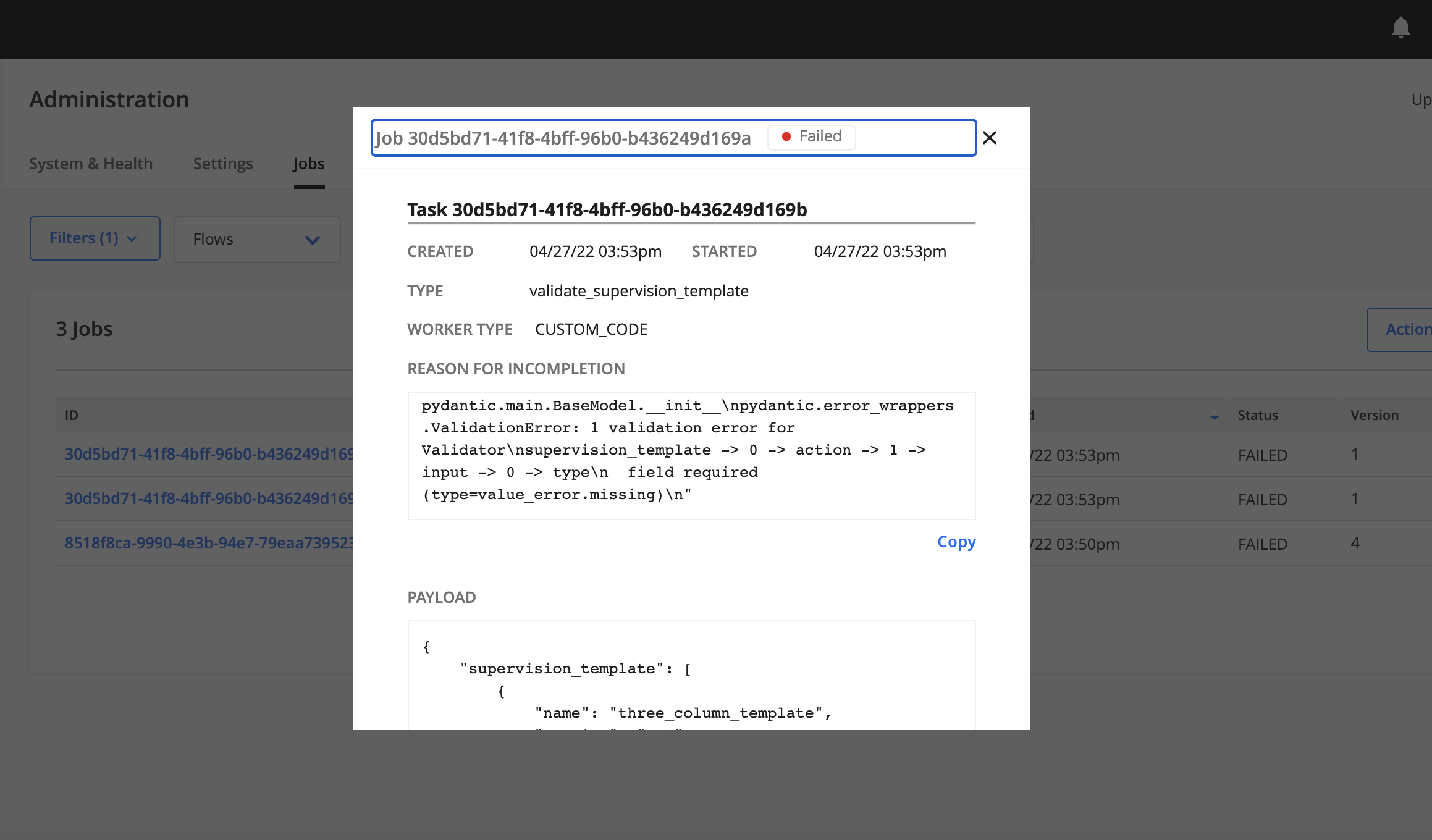
Property Definitions
A template will always have a base with two properties:
Property |
Description |
|---|---|
name |
Name of the Supervision template that should be tied to the UI. Valid names are currently limited to the amount of development done by the Hyperscience team. As of v34, the only valid name is |
version |
The Supervision template’s version. This property is for future use to handle version control as Custom Supervision evolves. Currently, the only available version for |
{
  supervision_template: [
    {
      name: 'three_column_template',
      version: '1.0'
    }
  ]
}
⚠️ While in the future you will be able to list multiple templates in the top-level list, currently only one is supported.
Three Column Template - Basics
For v34 and later, there is a single template that can be used with Custom Supervision, which is the three_column_template. There are three sections of this template: a thumbnail panel (left panel), an image panel (middle panel), and an actions panel (right panel). The thumbnail and actions panels are customizable, while the middle panel is not customizable and shows a full-page view of the document pages that are sent to Custom Supervision. If a table is selected, a section will appear at the bottom of the image panel with information about the table.
Property Definitions
Property |
Description |
|---|---|
thumbnail |
Configurable options for the thumbnail panel. |
actions |
List of tabs to be included in the action panel. Representative of the structure used in JSON Schema Form. |
{
  supervision_template: [
    {
      name: 'three_column_template',
      version: '1.0',
      thumbnail: {
        group_by_document: true,
        group_by_case: true
      },
      action: [
        {
          name: 'my_tab',
          display: 'SSN Info',
          input: [
            {
              name: 'ssn_field',
              type: 'transcription',
              data_identifier: '2afd7a67-ddee-484f-ab6b-2d292752e5ee',
              title: 'SSN'
            }
          ],
          ui: {
            groups: [
              {
                title: 'My Group',
                fields: ['ssn_field']
              }
            ]
          }
        }
      ]
    }
  ]
}
Three Column Template - Thumbnail
There are two options available for configuration of the left thumbnail panel. Both options are independent boolean values, which makes four different combinations possible:
Pages are listed individually and are not grouped (both options set to
false)Group by documents
Group by cases
Group by both documents and cases (both options set to
true)
Each screenshot is from the same set of pages, documents, and cases, but with different configurations.
thumbnail: {
  group_by_document: false,
  group_by_case: false
}

thumbnail: {
  group_by_document: true,
  group_by_case: false
}

thumbnail: {
  group_by_document: false,
  group_by_case: true
}

thumbnail: {
  group_by_document: true,
  group_by_case: true
}

Three Column Template - Actions
The action property will be a list of Tab objects. Each Tab in the action property corresponds to a tab in the Custom Supervision task’s right panel.
⚠️ You can have a maximum of 3 tabs. If you configure more than 3, they will be automatically truncated in the UI.
Property Definitions
⚠️ The
nameproperty must be unique.
Property |
Description |
|---|---|
name |
Internal name of the tab; only used for internal navigation and not displayed in the UI. |
display |
Text to display on the tab in the UI. Users will see this text as the name of tab. |
input |
List of Input Components as defined below. This list contains the bulk of the definition of what the Action pane is going to look like. |
ui |
Contains the |
Input Component Types
There are several different types of components that can be rendered in the first version of Custom Supervision. These components are specifically defined by the type property of each of the inputs.
The following types of Input Components are supported:
Titles
Text blocks
Transcriptions
Crops
Tables
Decisions
Cases
Chat
Search
Document Metadata
Title Components
There are two title components subtypes:
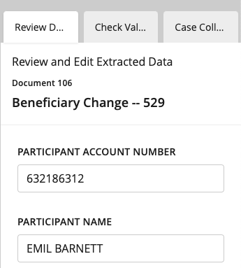
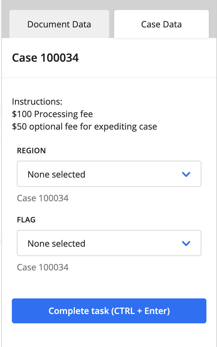
document_title- Designed to be used as a header when displaying document-related data. This component will display information for the currently selected document, including document ID and layout name.case_title- Designed to be used as a header when displaying case-related data. This component will display the case ID for the currently selected case.
Document Title Component
⚠️ The
nameproperty must be unique.
The name of the document_title input is needed for rendering, but it is not shown in the UI.
When defining a document_title component, set the type to document_title.
{
  action: [
    {
      name: 'document_tab',
      display: 'Document Data',
      input: [
        {
          name: 'doc_title',
          type: 'document_title'
        },
        ...
      ]
    }
  ]
}
Case Title Component
⚠️ The
nameproperty must be unique.
The name of the case_title input is needed for rendering, but it is not shown in the UI.
When defining a case_title component, set the type to case_title.
{
  action: [
    {
      name: 'case_tab',
      display: 'Case Data',
      input: [
        {
          name: 'case_title',
          type: 'case_title'
        },
        ...
      ]
    }
  ]
}
Text Block Components
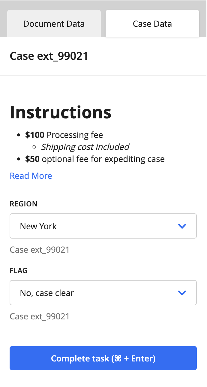
Text block components show static text on a tab. Text block components have a single subtype called text_block.
⚠️ The
nameproperty must be unique.
Property |
Description |
|---|---|
|
The text block component’s internal name. It is needed for rendering, but it is not shown in the UI. |
|
The text block component’s subtype. Currently, |
|
The text block component’s title that is displayed on the tab. |
|
Static text displayed on the tab. This property supports a subset of Markdown (read more in the “Markdown support” section below). Use |
Markdown support
In v37 and later, you can use Markdown in description text. The following Markdown functionality is officially supported:
Headers from H1 through H3
Blockquotes without nesting
Ordered and unordered lists with up to 3 levels of nesting
Strong (bold) and emphasised (italic) notation
Links
The following features are officially not supported and are disabled:
Inline HTML (disabled for security reasons and will be rendered as regular text when used)
Inputs
Tables
Footnotes
Any features that aren’t listed as supported or not supported are considered experimental features. Experimental features might work, but we cannot guarantee that their output will remain the same—or that they will work at all—in future versions.
Pro-tip - The value of description must be given as one line of text.
You can search the web for “slash escape text” to help you convert your Markdown text into a single line.
{
  action: [
    {
      name: 'case_tab',
      display: 'Case Data',
      input: [
        ...
        {
          name: 'instructions',
          type: 'text_block,
          title: '',
          description: '#Instructions\n\n- __$100__ Processing fee\n  - *Shipping cost included*\n- __$50__ optional fee for expediting case\n\n[Read More](https://hyperscience.com)'
        }
        ...
      ]
    }
  ]
}
Transcription Components
There are three transcription component subtypes:
transcription- Designed to be used with non-table fields.crop_transcription- Designed to be used with crops.table_transcription- Designed to be used with tables.
Transcription components are useful for showing both complete and incomplete values from the current submission or previous submissions. If the field, crop, or table is from the current submission, the user will be able to edit the value (or provide one if it is blank).
Transcription components respect the Custom Supervision Block’s Custom Supervision Transcription Masking setting. Once the data is matched with the component, we take advantage of the data_type_uuid associated with the data piece to include masking and validation based on this block setting.
Field Transcription Component
⚠️ The
nameproperty must be unique. If you use thefield_name, for example, it might not be unique and could cause issues when the Custom Supervision task is displayed.
Property |
Description |
|---|---|
name |
The transcription component’s internal name. It is needed for rendering, but it is not shown in the UI. |
type |
The transcription component’s subtype, which in this case is |
data_identifier |
Identifier that will match up with what is provided in the |
title |
If provided, the text for the label displayed in this component. If not provided, the field’s name, as stored in the database, will be used. |
{
  action: [
    {
      name: 'document_tab',
      display: 'Document Data',
      input: [
        ...
        {
          name: 'courtesy_amount',
          type: 'transcription,
          data_identifier: 'd82c1d10-45ff-4a66-b4a1-f300a0ff0a07',
          title: 'Courtesy Amount'
        },
        {
          name: 'legal_amount',
          type: 'transcription',
          data_identifier: 'b31c2239-d184-4914-8f17-d281c4df493b',
          title: 'Legal Amount'
        },
        ...
      ]
    }
  ]
}
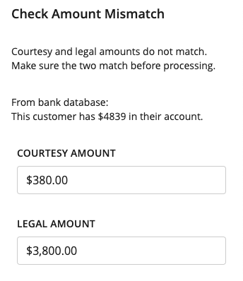
Transcription component when selected, showing masking and validation.
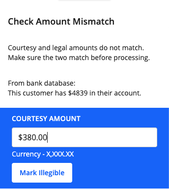
The Courtesy Amount will only allow numeric inputs and will have the currency format.
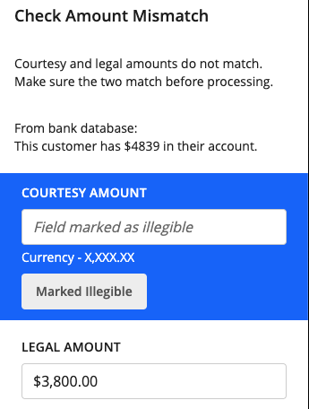
The Mark Illegible button, when clicked, will clear the field, and users will no longer be able to interact with the text box. Fields marked as illegible will have null as their values on submit.
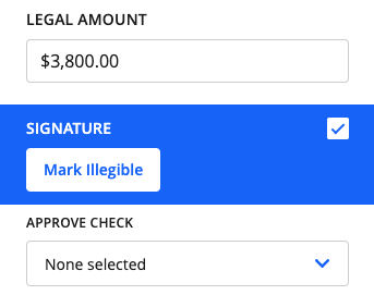
Checkboxes have their own rendering component, but they have the same features as text box fields.
Mandatory Transcriptions
In v39 and later, you can designate the transcriptions of certain fields as mandatory. This feature works similarly to mandatory Decision components. See the Mandatory Decisions section for more information.
All the same restrictions for mandatory Decisions apply to mandatory Field Transcriptions, along with the UI indicators for mandatory fields.
JSON Example
{
  action: [
    {
      name: 'document_tab',
      display: 'Document Data',
      input: [
        ...
        {
          name: 'courtesy_amount',
          type: 'transcription,
          data_identifier: 'd82c1d10-45ff-4a66-b4a1-f300a0ff0a07',
          title: 'Courtesy Amount'
          ui: {
            required: true
          },
        },
        ...
      ]
    }
  ]
}
Crop Transcription Component
Property |
Description |
|---|---|
name |
The crop transcription component’s internal name. It is needed for rendering, but it is not shown in the UI. |
type |
The transcription component’s subtype, which in this case is |
data_identifier |
Identifier that will be matched with what is provided in the data portion of the payload. For crop_transcription, this identifier is the UUID of the crop previously identified by the machine. |
{
  action: [
    {
      name: 'document_tab',
      display: 'Document Data',
      input: [
        ...
        {
          name: 'crop_1',
          type: 'crop_transcription,
          data_identifier: '84de1459-29be-4cc9-bfc7-c60896974a91',
        },
        {
          name: 'crop_2',
          type: 'crop_transcription,
          data_identifier: '4bcb43ef-d381-4fc8-a6b1-9cc05cc30b8b',
        },
        ...
      ]
    }
  ]
}
Simple design to display the values of the crops defined. You can also edit the value of these crops.
⚠️ Crop values are not saved to the database but are updated in the output JSON.
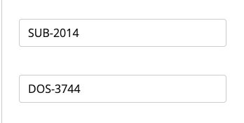
Table Transcription Component
Property |
Description |
|---|---|
name |
The transcription component’s internal name. It is needed for rendering, but it is not shown in the UI. |
type |
The transcription component’s subtype, which in this case is |
data_identifier |
Identifier that will match up with what is provided in the |
title |
If provided, the text for the label displayed in this component. If not provided, the table name will be used. |
columns |
An optional list of table columns. If included, only these columns will be displayed in the right-hand panel. |
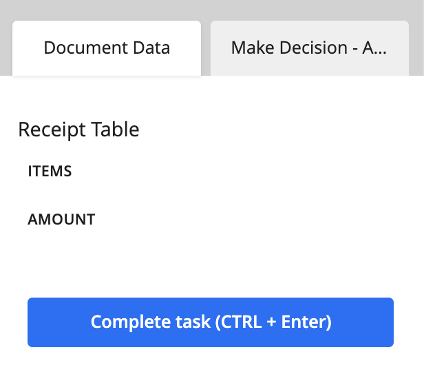
{
  action: [
    {
      name: 'document_tab',
      display: 'Document Data',
      input: [
        ...
        {
          name: 'receipt',
          type: 'table_transcription,
          data_identifier: '4fe5e47b-ccdb-4f42-8091-4cd48aa0bd0a',
          title: 'Receipt Table'
        },
        ...
      ]
    }
  ]
}
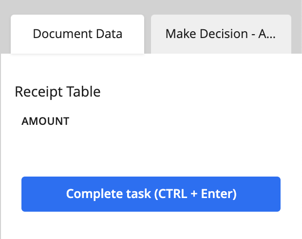
With only one column selected.
{
  action: [
    {
      name: 'document_tab',
      display: 'Document Data',
      input: [
        ...
        {
          name: 'receipt',
          type: 'table_transcription,
          data_identifier: '4fe5e47b-ccdb-4f42-8091-4cd48aa0bd0a',
          title: 'Receipt Table',
          columns: [
            {
              uuid: '672185ce-dbd2-45f9-bd50-d066cfed00cf'
            }
          ]
        },
        ...
      ]
    }
  ]
}
Decision Component
Unique to Custom Supervision is the ability to make decisions on different entities. Decisions, or decision components, are drop-down menus with options from a predetermined set of choices set in the JSON configuration. A decision component can be tied to a document, case, page, field, or table cell.
To add a decision component, you need to define the properties described in the sections below.
title
The display header, or name, for the decision component.
relation
A nested object containing a required type property. If the decision applies to a field or table cell, you need to define another required property called match.
type- string - Type of entity you want to associate with the decision component. The possible values for thetypeproperty are the following:case- Associates the decision with the currently selected case.document- Associates the decision with the currently selected document.page- Associates the decision with the currently selected page.field- Associates the decision with a predefined field.table_cell- Associates the decision with a predefined table cell.
match- string - Only used forfieldandtable_celltype decisions. This value is the same as the field’s layout UUID and the table cell’s UUID. Therelationobject uses thismatchproperty to associate the decision with a predefined field or table cell.
⚠️ Even though we use layout field UUID as the
data_identifierto match the decision for fields, we still save it back to the specific Field ID when a decision is made.
⚠️ Note that the decision component is not responsible for populating the values related to its relation e.g.
fieldnames,table_cellvalues or bounding boxes. To include that information, the appropriate component will also be included in the supervision template.
Mandatory Decisions
For decision fields, there is now an additional flag to mark the decision as “Required”.
required- boolean - Marks the decision field as mandatory. The keyer must select a choice for the decision field in order to complete the task.
⚠️ Mandatory decisions are exactly that: mandatory. If decisions are configured with this setting, then the supervision task cannot be completed until the decision has a choice selected for it. There is no way to bypass this requirement.
JSON Example
{
  action: [
    {
      name: 'Decisions',
      display: 'Decisions',
      input: [
        {
          name: '_decision',
          type: 'decision',
          title: 'Document Decision',
          relation: {
            type: 'document'
          },
          ui: {
            required: true
          },
          schema: {
            oneOf: [
              {
                const: 'accept',
                title: 'Accept Document'
              },
              {
                const: 'reject',
                title: 'Reject Document'
              }
            ]
          }
        }
      ]
    }
  }
}
There are a couple different indicators that appear in the supervision task to let the keyer know which decisions are required.
Right-hand panel
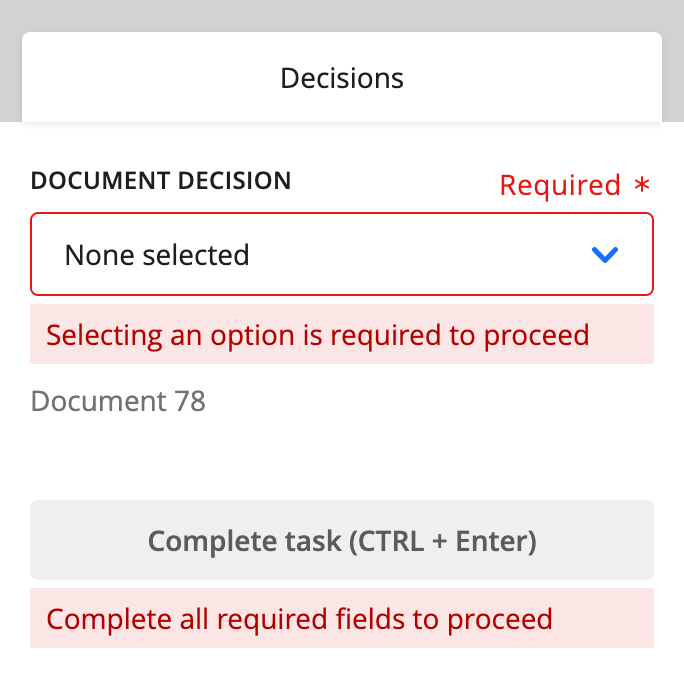
Left-hand panel
Depending on the decision relation type, we have different levels of notifications that will appear in the supervision task.
Page-level and Document-level
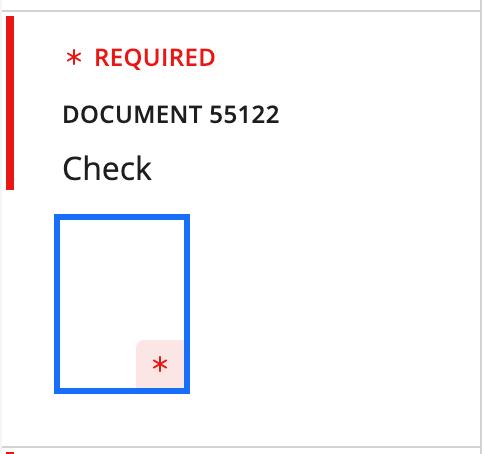
For page-level decisions, the page that the decision is associated with will be marked with an asterisk. For document-level decisions, you will see the “* REQUIRED” indicator above the document ID.
Case-level
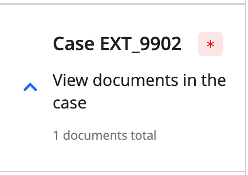
For case-level decisions, you will see an indicator next to the case’s external ID.
Completing the task
As you select a choice for each mandatory decision, these indicators will disappear, signaling to the keyer that there are no required decisions left for the page, document, or case.
Once all mandatory decisions are complete, the “Complete task” button will be enabled.
schema
A nested object containing an array. You need to define one and only one of the following arrays:
oneOf- array - Selection type for a single-select decision.anyOf- array - Selection type for multi-select decision.
Regardless of the array type, it contains a list of choices with these properties:
{
  const: 'my_internal_choice_name',
  title: 'Display Choice Name'
}
The title is the option’s name that will be displayed in the UI.
The const is the option’s internal name. It is used if there is a need to define an internal value that will be passed along in the workflow and eventually stored in the database.
default_value
This is an optional property that allows you to specify a default or pre-selected value for the decision. You should provide the const value(s) to be pre-selected in a list.
default_value: ['first_choice']
If the decision is multi-select you can provide multiple values.
default_value: ['first_choice', 'third_choice']
Single-select document decision
{
  action: [
    {
      name: 'document_tab',
      display: 'Document Data',
      input: [
        ...
        {
          name: 'check_decision',
          type: 'decision',
          title: 'Decision',
          relation: {
            type: 'document'
          },
          schema: {
            oneOf: [
              {
                const: 'accept',
                title: 'Accept Check'
              },
              {
                const: 'reject',
                title: 'Reject Check'
              },
              {
                const: 'return',
                title: 'Return overpaid fees'
              }
            ]
          }
        },
        ...
      ]
    }
  ]
}
Default state - No option previously selected
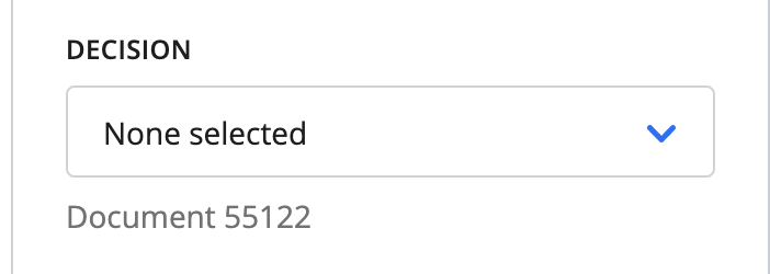
The default state of the decision component is “None selected”. When the type property is case, document, or page, a footer label appears below the decision field to provide context.
Open state:
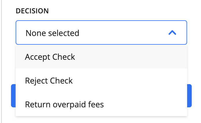
When opened, the decision component displays the available options.
Default state - default_value specified
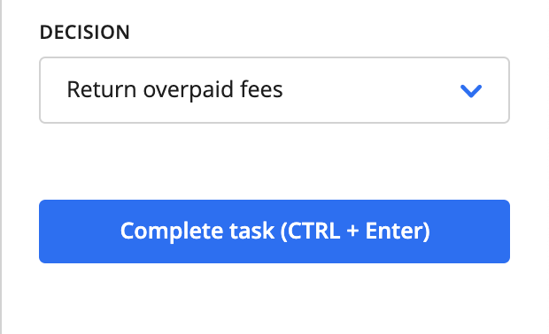
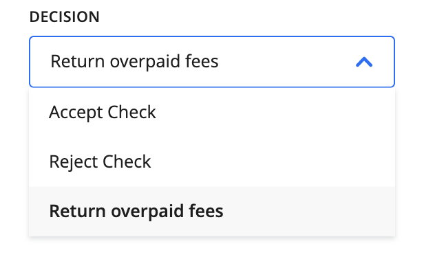
When the task loads the value specified by default_value is already selected. In the case of multi-select decisions, all specified values are selected.
Single-select field decision - includes the transcription field that the decision is tied to for context. Note the match and data_identifier are the same UUID.
{
  action: [
    {
      name: 'document_tab',
      display: 'Document Data',
      input: [
        {
          name: 'first_name',
          type: 'transcription,
          data_identifier: '29e7ff35-a085-415e-9fe2-9dd464a24971',
          title: 'First Name'
        },
        {
          name: 'first_name_single_decision',
          type: 'decision,
          title: 'My Decision',
          relation: {
            type: 'field',
            match: '29e7ff35-a085-415e-9fe2-9dd464a24971'
          },
          schema: {
            oneOf: [
              {
                const: 'first_choice',
                title: 'My First Choice'
              },
              {
                const: 'second_choice',
                title: 'My Second Choice'
              }
            ]
          }
        },
        ...
      ]
    }
  ]
}
The default state of the decision component is pre-populated from an existing decision in the database. Here, the default state is for My First Choice to be selected.
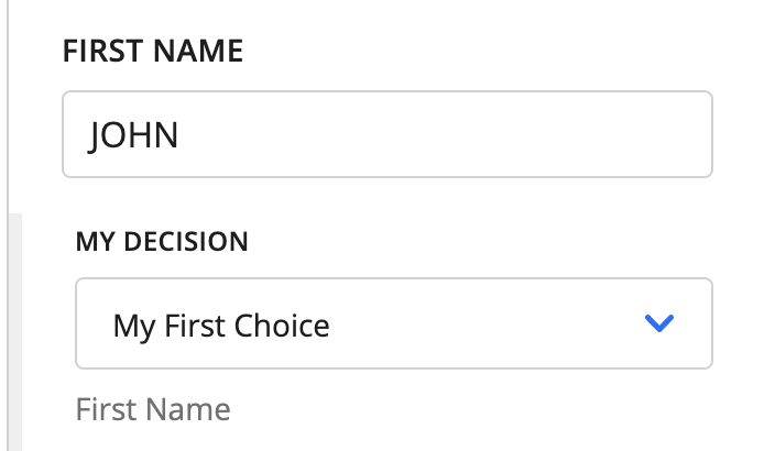
When the type property’s value is field, a footer label appears below the decision field displaying the value of the title property of the input field.
⚠️ There is also an indented state with a visual indicator to try to help the user associate the decision with the field. You need to order the inputs properly, though, to get this effect. They do NOT order themselves automatically. See UI Groups.
Open state:
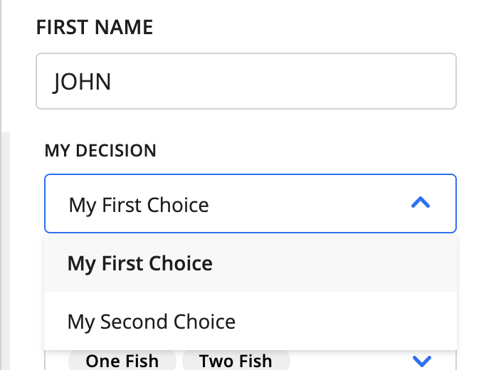
When opened, the decision component displays the available options.
Decision filtering:
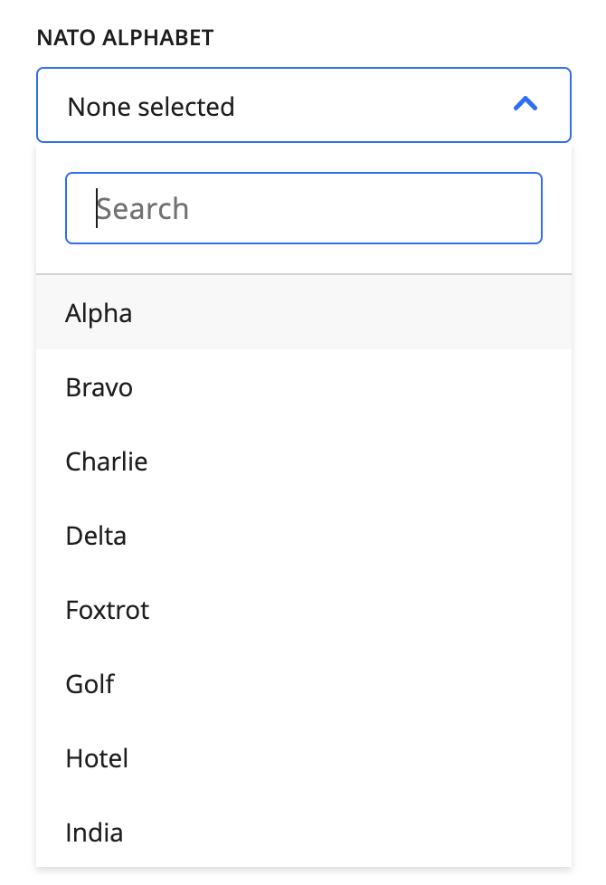
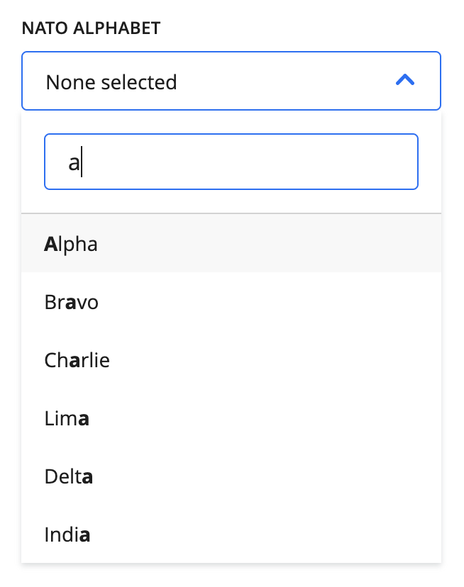
When there are ten or more options for a decision, a search bar will appear to filter the options.
Multi-select field decision
{
  action: [
    {
      name: 'document_tab',
      display: 'Document Data',
      input: [
        {
          name: 'first_name',
          type: 'transcription,
          data_identifier: '29e7ff35-a085-415e-9fe2-9dd464a24971',
          title: 'First Name'
        },
        ...
        {
          name: 'first_name_multiple_decision',
          type: 'decision',
          title: 'Multi Decision',
          relation: {
            type: 'field',
            match: '29e7ff35-a085-415e-9fe2-9dd464a24971'
          },
          schema: {
            anyOf: [
              {
                const: 'one',
                title: 'One Fish'
              },
              {
                const: 'two',
                title: 'Two Fish'
              },
              {
                const: 'red',
                title: 'Red Fish'
              },
              {
                const: 'blue',
                title: 'Blue Fish'
              }
            ]
          }
        },
        ...
      ]
    }
  ]
}
The default state of the decision component is pre-populated from existing decisions in the database. Here, the default state is for both One Fish and Two Fish to be selected.
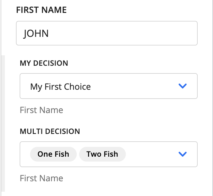
My Decision is the same single-select decision from above, but Multi Decision is the rendering of the JSON we have defined on the left.
The same notes from above about how the footer label and indentation behave apply here, as well.
Open state:
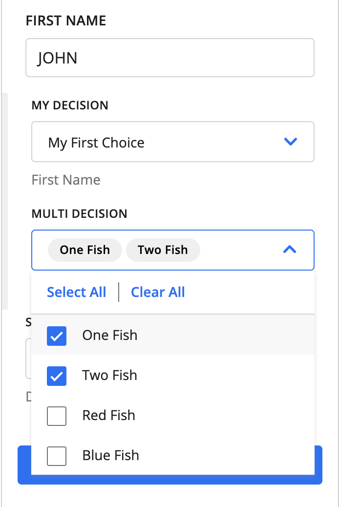
When opened, the decision component displays the available options.
Single-select table cell decision
{
  action: [
    {
      name: 'document_tab',
      display: 'Document Data',
      input: [
        {
          name: 'table_name',
          type: 'table_transcription,
          data_identifier: '0fcac26e-4332-490f-a728-bcc44be47b30',
          title: 'Receipt Table'
        },
        ...
        {
          name: 'table_cell_decision',
          type: 'decision',
          title: 'Example Table Cell Decision',
          relation: {
            type: 'table_cell',
            match: '7decaca3-c59c-4fb8-ae56-f08d5d2ad14e'
          },
          schema: {
            oneOf: [
              {
                const: 'one',
                title: 'One Fish'
              },
              {
                const: 'two',
                title: 'Two Fish'
              },
              {
                const: 'red',
                title: 'Red Fish'
              },
              {
                const: 'blue',
                title: 'Blue Fish'
              }
            ]
          }
        },
        ...
      ]
    }
  ]
}
Although table cell decisions are configured in the tabs portion of the Supervision Template, they appear underneath the table editor when the impacted cell is selected.
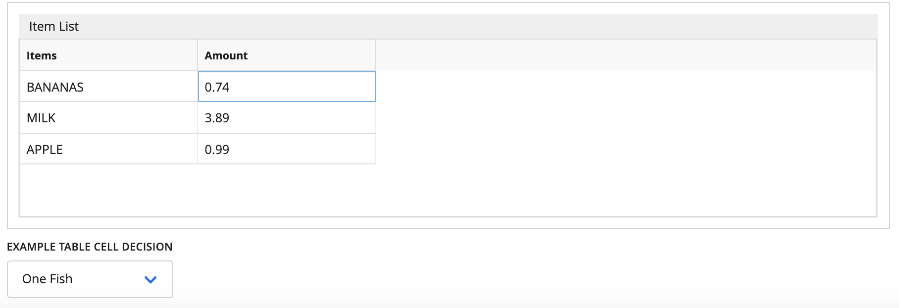
Multi-select decisions are also supported for table cell decisions and behave in a similar manner to field decisions. They also will appear below the table cell when it is active.
dependencies
There is an additional use case for dependencies for decisions. You can create a parent/child relationship between two different decisions, where one set of options (child) depends on the selected choice of another decision (parent).
⚠️ There are two caveats: these relationships can only be configured between either document-level or case-level decisions. Also, these relationships cannot be nested, meaning that there cannot be parent-to-child-to-grandchild relationships.
There are two different “types” that are configurable for these relationships: decision dependencies within the same document (or case) and decision dependencies across documents (or cases).
Decisions within the same document
JSON Example
{
  action: [
    {
      name: 'job_offer_tab',
      display: 'Job Offer',
      input: [
        {
          name: 'javascript',
          type: 'decision',
          title: 'Has javascript experience?',
          relation: {
            type: 'document'
          },
          schema: {
            oneOf: [
              { const: 'yes', title: 'Yes' },
              { const: 'no', title: 'No' },
              { const: 'partial', title: 'Needs Revision' },
            ]
          }
        },
        {
          name: 'job_offer',
          type: 'decision',
          title: 'Select job offer:',
          relation: {
            type: 'document'
          },
          schema: {
            oneOf: [
              {
                const: 'be',
                title: 'Backend Engineer'
              },
              {
                const: 'senior_be',
                title: 'Senior Backend Engineer'
              }
            ]
          },
          dependencies: [
            {
              condition: {
                properties: {
                  decisions: {
                    type: 'array'
                    contains: {
                      anyOf: [
                        {
                          type: 'object',
                          properties: {
                            decisionName: {
                              const: 'javascript'
                            },
                            decisionValue: {
                              const: ['yes']
                            },
                            isCurrentDocument: {
                              const: true
                            }
                          }
                        },
                        {
                          type: 'object',
                          properties: {
                            decisionName: {
                              const: 'javascript'
                            },
                            decisionValue: {
                              const: ['partial']
                            },
                            isCurrentDocument: {
                              const: true
                            }
                          }
                        }
                      ]
                    }
                  }
                }
              },
              override: {
                schema: {
                  oneOf: [
                    {
                      const: 'fe',
                      title: 'Frontend Engineer'
                    },
                    {
                      const: 'senior_fe',
                      title: 'Senior Frontend Engineer'
                    }
                  ]
                }
              }
            }
          ]
        }
      ]
    }
  ]
}
Here the “javascript” decision is the parent, which is defined as any other decision would be.
The definition comes from the “job_offer” decision, specifically in the dependencies block. A condition + override pair is created to map out the relationship.
On a more detailed level, there is some JSON schema syntax to identify that describes the decisions object captured with the context of our task. There are also potentially multiple conditions to check against (anyOf).
...
properties: {
  decisions: {
    type: 'array'
    contains: {
      anyOf: [...]
      ...
    }
    ...
  }
}
Within the anyOf block, we have the conditions defined that would trigger the override.
...
anyOf: [
  {
    type: 'object',
    properties: {
      decisionName: {
        const: 'javascript'
      },
      decisionValue: {
        const: ['yes']
      },
      isCurrentDocument: {
        const: true
      }
    }
  },
  {
    type: 'object',
    properties: {
      decisionName: {
        const: 'javascript'
      },
      decisionValue: {
        const: ['partial']
      },
      isCurrentDocument: {
        const: true
      }
    }
  }
]
...
decisionNamedefines the parent decision that the child depends on.decisionValuedefines the value that must be selected in that decision to trigger the override.isCurrentDocumentindicates that this dependency occurs within the same document.isCurrentCaseis not seen in this example, but it is analogous toisCurrentDocument, and the two are mutually exclusive.
There are two conditions that can apply the override here:
“Yes” is chosen for the “Has javascript experience?” question.
“Needs Revision” is chosen for the “Has javascript experience?” question.
...
override: {
  schema: {
    oneOf: [
      {
        const: 'fe',
        title: 'Frontend Engineer'
      },
      {
        const: 'senior_fe',
        title: 'Senior Frontend Engineer'
      }
    ]
  }
}
...
If either of these options are chosen, then the options of this decision are changed to more appropriate Frontend-related choices.
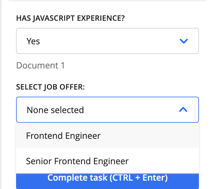
If no option is selected in the parent, or an option not defined in the dependency is chosen, then we use the original schema defined for the decision:
...
schema: {
  oneOf: [
    {
      const: 'be',
      title: 'Backend Engineer'
    },
    {
      const: 'senior_be',
      title: 'Senior Backend Engineer'
    }
  ]
},
...
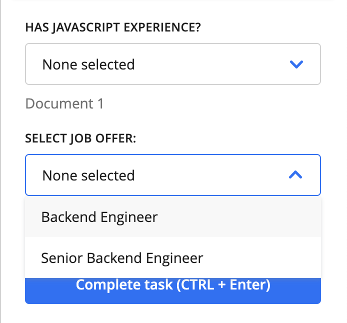
⚠️ If a parent is updated after an option has been selected in its child decision, that option will be unselected IF the update to the parent makes that option unavailable.
Decisions across documents
We recommend reading the section above, “Decisions within the same document,” as there are many concepts there that also apply to decision dependencies across documents and cases.
The differences between the configurations are described below.
JSON Example
{
  action: [
    {
      name: 'insurance_tab',
      display: 'Insurance',
      input: [
        {
          name: 'provider',
          type: 'decision',
          title: 'Medical insurance provider:',
          relation: {
            type: 'document'
          },
          schema: {
            oneOf: [
              {
                const: 'a',
                title: 'Provider Alpha'
              },
              {
                const: 'b',
                title: 'Provider Bravo'
              },
              {
                const: 'c',
                title: 'Provider Charlie'
              }
            ]
          },
          ui: {
            hidden: true
          },
          dependencies: [
            {
              condition: {
                properties: {
                  layoutId: {
                    const: '<insurance_card_uuid>'
                  },
                },
              },
              override: {
                ui: {
                  hidden: false
                }
              }
            }
          ]
        },
        {
          name: 'billing_code',
          type: 'decision',
          title: 'Select billing code:',
          relation: {
            type: 'document'
          },
          schema: {
            oneOf: []
          },
          ui: {
            hidden: true
          },
          dependencies: [
            {
              condition: {
                properties: {
                  layoutId: {
                    const: '<eob_uuid>'
                  }
                }
              },
              override: {
                ui: {
                  hidden: false
                }
              }
            },
            {
              condition: {
                properties: {
                  decisions: {
                    type: 'array',
                    contains: {
                      anyOf: [
                        {
                          type: 'object',
                          properties: {
                            decisionName: {
                              const: 'provider'
                            },
                            decisionValue: {
                              const: ['a']
                            }
                          }
                        }
                      ]
                    }
                  }
                }
              },
              override: {
                schema: {
                  oneOf: [
                    {
                      const: 'a1',
                      title: 'Code A024'
                    },
                    {
                      const: 'a2',
                      title: 'Code A099'
                    }
                  ]
                }
              }
            },
            {
              condition: {
                properties: {
                  decisions: {
                    type: 'array',
                    contains: {
                      anyOf: [
                        {
                          type: 'object',
                          properties: {
                            decisionName: {
                              const: 'provider'
                            },
                            decisionValue: {
                              const: ['b']
                            }
                          }
                        }
                      ]
                    }
                  }
                }
              },
              override: {
                schema: {
                  oneOf: [
                    {
                      const: 'b1',
                      title: 'Code fre_87'
                    },
                    {
                      const: 'b2',
                      title: 'Code ortho_12'
                    }
                  ]
                }
              }
            },
            {
              condition: {
                properties: {
                  decisions: {
                    type: 'array',
                    contains: {
                      anyOf: [
                        {
                          type: 'object',
                          properties: {
                            decisionName: {
                              const: 'provider'
                            },
                            decisionValue: {
                              const: ['c']
                            }
                          }
                        }
                      ]
                    }
                  }
                }
              },
              override: {
                schema: {
                  oneOf: [
                    {
                      const: 'c1',
                      title: 'Code C038'
                    },
                    {
                      const: 'c2',
                      title: 'Not Covered'
                    }
                  ]
                }
              }
            }
          ]
        }
      ]
    }
  ]
}
In this scenario, we have two different types of documents, but the structure is very similar to the configuration for setting up dependencies within the same document or case.
The largest difference here is that we do need isCurrentDocument or isCurrentCase defined within the condition properties.
Other than that, the configuration of this example is a bit longer, but mainly because we have different options for a range of different choices in the parent. The core of the syntax and logic is the same. Again, there are more detailed explanations of these properties in the “Decisions within the same document” section.
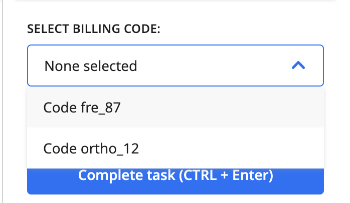
Selecting Provider Alpha in the parent

Updating the billing codes
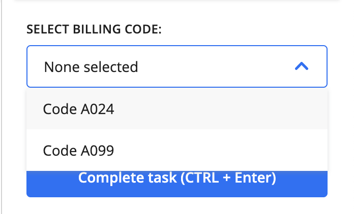
Going back to updating to Provider Bravo in the parent

Updating the available billing codes again
Add to Case Component
This component is rather unique and allows users to add a document to an existing case or add a document to a newly created case. You can also edit the case assignment of documents that already belong to cases.
Note that in order for the case assignments to be saved in the database, a Machine Collation Block must follow the Custom Supervision Block.
{
  action: [
    {
      name: 'document_tab',
      display: 'Document Data',
      input: [
        ...
        {
          name: 'assign_to_case',
          type: 'case_dropdown',
          title: ''
        },
        ...
      ]
    }
  ]
}
⚠️ The
nameproperty must be unique.
The name and title properties are not shown in the UI, but are still included in the JSON.
The only valid value for type in Add to Case fields is case_dropdown.
Default state when document is not assigned to a case:
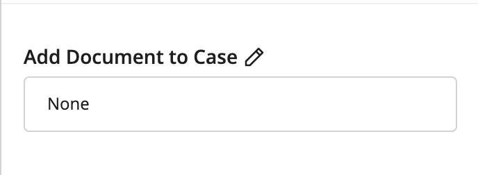
The default value of this component is None. To assign a document to a case, click the pencil (“Edit”) button, and an “Add to case” dialog box will appear. This dialog box is very similar to the one used when assigning a submission to a case during Submission Upload.
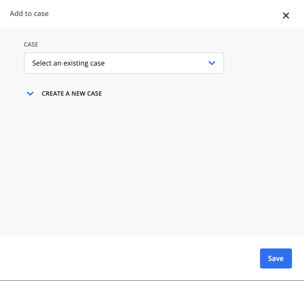
Assigning to an existing case
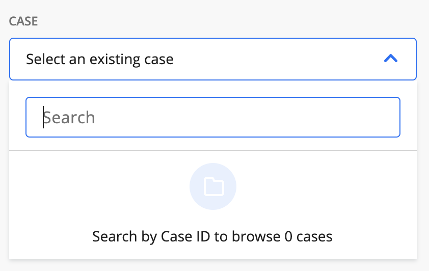
Lazy-loaded case lookup. When you type in the search bar, a list of matching cases appears. You can search only by case ID.
Assigning to a new case
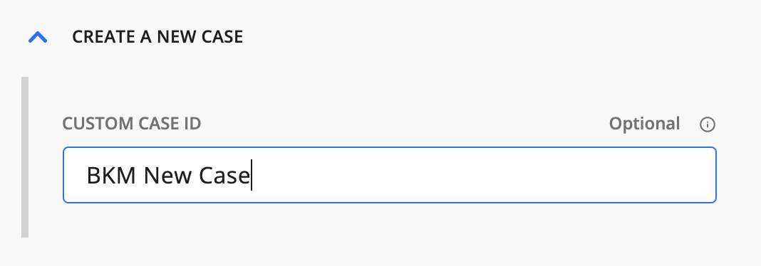
To assign to a new case, click the Create a new case link and enter a custom case ID.
State when case is assigned
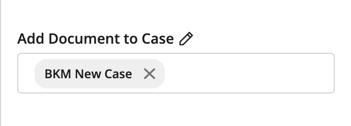
Nothing is assigned until the entire task is submitted, so you can freely edit this multiselect as much as you want.
To cancel the addition of a document to a case, click the case’s “X” button.
You can assign a document to multiple cases at once.
Case Note Component
This component allows users to add or edit the case note for a case.
Example
{
  action: [
    {
      name: 'case_note_tab',
      display: 'Case Note Data',
      input: [
        ...
        {
          name: 'case_notes_name',
          type: 'case_notes',
          title: ''
        },
        ...
      ]
    }
  ]
}
⚠️ The
nameproperty in the input must be unique.
The name and title properties in input are not shown in the UI, but they are still required in the JSON template.
The only valid value for type in Case Note fields is case_notes.
Default state when no case notes have been specified for a case:
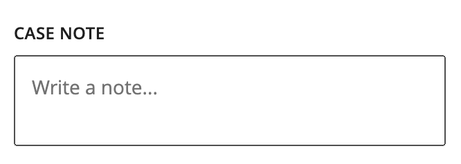
The disabled state when the selected page or document is not associated with a case:
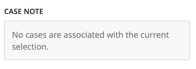
To add or edit a case note during a Custom Supervision task, enter the note in the text box. When the task is completed and the Machine Collation Block is run, the new case note will be saved for the case.
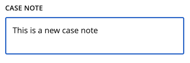
In order for the case notes to be saved in the database, a Machine Collation Block must follow the Custom Supervision Block.
When pages are grouped by case in Custom Supervision, only the case notes of the selected document will be updated.
If a page or document is not grouped by case, that page or document may be assigned to more than one case. However, it is not currently possible to choose which assigned case to edit during Custom Supervision. For these ungrouped pages or documents, only one assigned case (and its case note) can be viewed at a time. Any case notes edits will apply to all assigned cases for the selected page or document. If no edits are made, then there will be no applied changes to any of the assigned cases.
The character limit for a case note is 2000 characters.
Chat Component
In v41 and later, we provide access to the chat component, a simple chat interface that allows users to send messages back and forth with a backend service. Currently, the chat functionality requires the initiation of a designated flow. The primary role of this flow is to take the user message, collect context, make API calls to a third-party conversational service (such as Gemini or Claude), and return the response.
You can use our LLM Blocks or Python Code Blocks to make calls to the third-party large language model (LLM) of your choice. The chat interface expects a response from the chat flow, which is then displayed in the chat window.
Property |
Description |
|---|---|
name |
The internal name. It is needed for rendering, but it is not shown in the UI. |
type |
The component type, which is always |
title |
Text for the label displayed for this component. |
data_identifier |
The |
options |
See Options table below. All |
Options
Property |
Description |
|---|---|
minimized |
Optional - Controls whether the chat component initially renders as a button that expands into a chat window. Defaults to |
full_height |
Optional - Controls whether the chat window is rendered at the full height of the actions panel. Defaults to |
welcome_message |
Optional - Object that includes a |
Example of the chat interface configuration with the default options (see screenshot below)
{
  action: [
    {
      name: 'document_tab',
      display: 'Document Data',
      input: [
        {
          name: 'chat_field',
          type: 'chat',
          title: 'Hyperscience Chat',
          data_identifier: 'CHAT_COMPLETION_FLOW',
        },
        ...
      ]
    }
  }
}
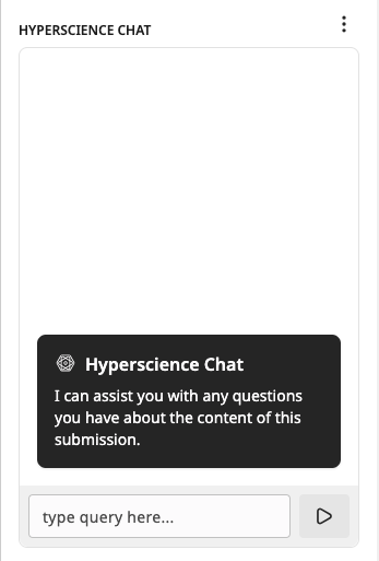
Example of chat interface configuration with custom options (see screenshot below)
{
  name: 'chat_field',
  type: 'chat',
  title: 'Hyperscience Chat',
  data_identifier: 'CHAT_COMPLETION_FLOW',
  options: {
    minimized: true,
    full_height: true,
    welcome_message: {
      title: 'Welcome to AMA chat',
      message: 'Ask me anything!'
    }
  }
}

Chat Features
Maintaining chat history
All messages from the user and responses from the system are temporarily stored in the browser for a specific task and user. As a result, a user can chat, close the task, and return to the task later, and the chat session will resume where the user left off. This chat history will expire 7 days after the last message is sent.
Clearing chat history
With each additional message, we send the entire chat history to the flow. The intention is that the history can be provided to the LLM to help provide context. However, if you want to clear the chat history, you can click the provided button, which clears both the text in the chat window and the history stored in the browser.
⚠️ There can also be instances where users can reach the token limit depending on the LLM they are working with. Clearing the chat history can help alleviate this issue.
Minimizing chat window
There is a button provided to minimize the chat window to provide more space for the other fields.
Error state
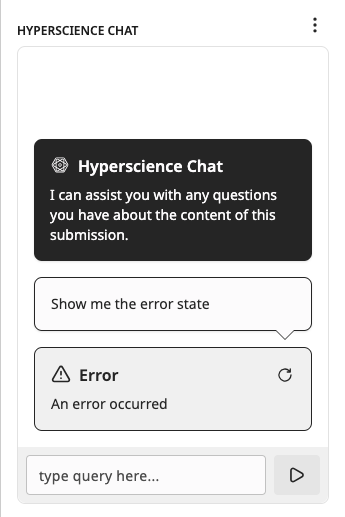
There is an error state that can be triggered to handle unexpected responses, including if the chat flow fails to respond. In this state, an error message is shown, along with a retry button to resend the last chat message if it makes sense to do so.
Chat Data
There is an additional requirement for the chat infrastructure: a new section of the Data Payload that includes chats.
⚠️ The
chatssection of data payload must be manually added, even while using the IDP Custom Supervision Block.
Property |
Description |
|---|---|
type |
The type of chat implementation. Currently, we only support |
identifier |
When |
input |
Custom object where the properties and values are added as inputs to the chat flow. |
JSON Example
{
  ...
  "data": {
    ...
    "chats": [
      {
        "type": "flow",
        "identifier": "CHAT_COMPLETION_FLOW",
        "input": {
          "context": "Extra context",
          "reference_id": "123"
        }
      }
    ]
  }
}
Chat Flow
The chat flow that is triggered from the chat messages is open-ended, but there is a general structure that is recommended to get the most out of the LLM:
Leverage Custom Code Blocks - The flexibility of these blocks helps to construct inputs and deconstruct outputs. Tailor the inputs to the third-party LLM and the outputs to the chat interface.
Standard inputs for the flow - The chat flow includes the following as inputs:
question- The user message from the chat component to provide context to the third-party LLM.answers- All previous responses provided by the LLM to maintain context within the chat session.Additional inputs - Through the
data.chatsblock interface, you can pass additional information from the main flow to the chat flow. The chat flow can then use this information to help with the conversation.
Provide extra context from the submission - You can do so by performing Full Page Transcription (FPT) on the submission beforehand, storing the results in blob storage, and then adding it to the context.
Include context guardrails - Most LLMs allow for system-level context to be added when asking questions. This context can help the LLM to both provide more accurate responses and to shape the responses’ content and format in specific ways. Some examples of context guardrails include:
“Use the following pieces of context to answer the question at the end.”
“Don’t try to make up an answer if the answer cannot be found in the provided context.”
“Reply with two sentences maximum. Keep the answer as concise as possible.”
Ensure graceful error handling - Make sure to handle errors and unexpected responses from the third-party LLM. Sending a response back to the user can be helpful to let them know that something went wrong.
Search Component
In combination with Storage (available in v38 and later), Search components look up custom items that are kept in Storage. Based on the item selected, the properties of the item can be mapped to transcription fields defined alongside the Search component.
Property |
Description |
|---|---|
name |
The internal name. It is needed for rendering, but it is not shown in the UI. |
type |
The component type, which is always |
params |
See Params properties table below. |
property_to_field |
A map of properties of the selected item from the search field to corresponding transcription fields in the task. More details can be found after the examples below. |
display_accessors |
A list of property names used for display purposes in the UI. More details can be found after the examples below. |
⚠️ As of v38,
display_accessorsonly supports a single property name.
Params properties
Property |
Description |
|---|---|
collection |
The |
Mapping to transcription fields
JSON Example
{
  action: [
    {
      name: 'search_tab',
      display: 'Search Results',
      input: [
        ...
        {
          type: 'search',
          params: {
            'collection': 'recipe',
          },
          property_to_field: {
            name: ['dessert_name'],
            kilocalories: ['dessert_kilocalories'],
            author: ['dessert_author'],
          },
          display_accessors: ['name']
        },
        {
          name: 'dessert_name',
          type: 'transcription',
          data_identifier: '7174ebc4-a5d5-4705-8ed0-3d3211092a16',
          title: 'Dessert Name'
        },
        {
          name: 'dessert_kilocalories',
          type: 'transcription',
          data_identifier: 'ad806af5-c1c0-4225-8470-6cedafbb023b',
          title: 'Dessert Calories'
        },
        {
          name: 'dessert_author',
          type: 'transcription',
          data_identifier: 'dfbf11d6-f2c5-4da6-b8d0-f94c9f6ee0ba',
          title: 'Dessert Author'
        },
        ...
      ]
    }
  ]
}
In this scenario, we have a search field mapped to three different transcription fields. This mapping is controlled by property_to_field.
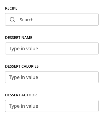
To help illustrate this concept, we will also define what the Item from Storage looks like:
{
  id: 'd4a4c906-0d17-4c8a-b845-95396fa62970',
  collection: 'recipe',
  properties: {
    name: 'Creme Brulee',
    kilocalories: 123,
    author: 'Wolfgang Puck'
  }
}
Keep in mind that we are storing a completely customizable item. And, for this example, we can say that we have several hundred of these items in the collection 'recipe' with different name, kilocalories, and author values.
You can use the Search component to look up these items by the collection specified in the Search component’s params.
When the search bar is initially clicked, we immediately perform a search for all items in the
collection.Based on what you enter in the search bar, it performs a substring search across all
propertiesdefined on the Item.
⚠️ We have limited the results of the search to 50 results. If the option you want is not in the 50 results, you will need to perform a more specific search.
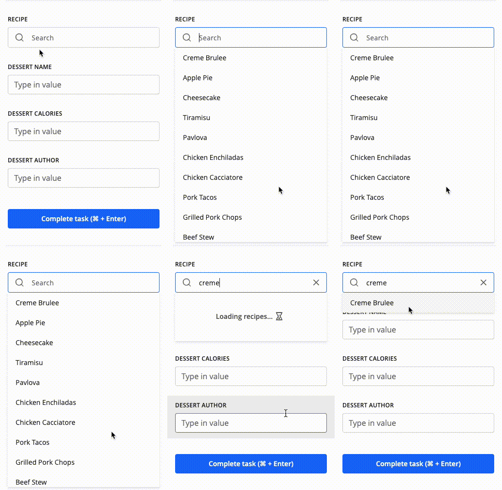
display_accessors is used when generating the options in the dropdown list. With what we defined in our example, when the dropdown list opens, the name values of the recipe items are shown.
Upon selecting an item from the results of your search, we then map the properties of the Item to the fields defined in property_to_field.
To extend the example, when “Creme Brulee” is selected:
dessert_nametranscription field is populated with “Creme Brulee”.dessert_kilocaloriestranscription field is populated with “123”.dessert_authortranscription field is populated with “Wolfgang Puck”.
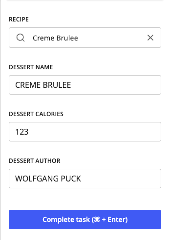
We do not track the Storage Item beyond populating the associated transcription fields. The Search component should be viewed as a tool to help populate defined transcription fields. When completing the task, we extract the information from the transcription field and do not look at the search field.
⚠️ You can overwrite what you select by typing in the transcription field. If you perform another search, it will again update the associated transcription fields. The last action taken will be used to update the transcription field.
Document Metadata Component
Document Metadata components are used to add, edit, or remove metadata values from a document. The metadata is stored in the database on the Document object and can be used for downstream processing in a flow.
Metadata properties on the document are key-value pairs. Each key is a string, and each value is a list of strings.
Property |
Description |
|---|---|
name |
The internal name. It is needed for rendering, but it is not shown in the UI. |
type |
The component type, which is always |
title |
Text for the label displayed for this component. |
metadata_keys |
List of keys from the Document Metadata object to be displayed in the UI. |
restricted_values |
Boolean value that determines if the user can add strings to / remove strings from the key’s value. |
With this component, the user is not able to change metadata key strings. As mentioned, they can add, edit, or remove value strings for the keys defined in the Supervision template.
JSON Example
{
  action: [
    {
      name: 'document_metadata_tab',
      display: 'Document Metadata',
      input: [
        ...
        {
          name: 'document_metadata_field_name',
          type: 'document_metadata',
          title: 'Document Metadata',
          metadata_keys: [
            'external_id',
            'other_information'
          ],
          restricted_values: false,
        },
        ...
      ]
    }
  ]
}
In this scenario, the user sees the keys listed in the component definition: “external_id” and “other_information”.
There are two possible initial states of the metadata field in the UI, depending on whether there is existing data or not.
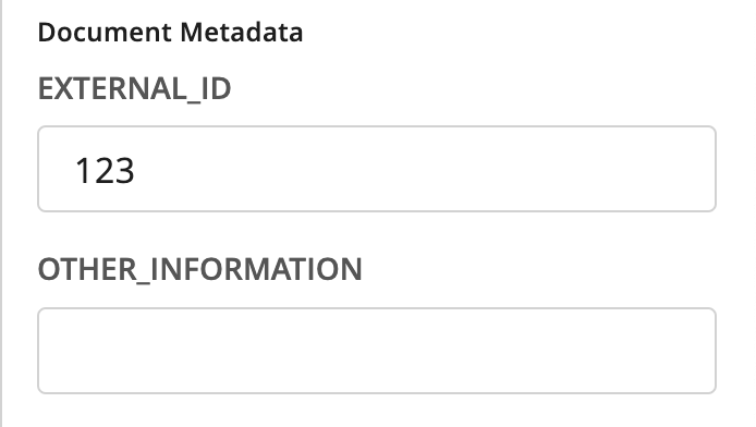
If there is no existing metadata, when the task loads, the Document Metadata field will appear as follows:
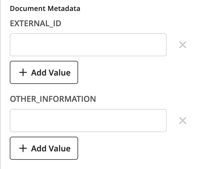
If there is existing metadata, for example:
{
  ...
  metadata: {
    external_id: ['123'],
    other_information: ['ABC', 'DEF'],
  }
then the Document Metadata field will be pre-populated with the existing metadata.
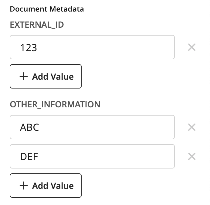
The user will then be able to perform the add, edit, and remove actions on the values, as mentioned before.
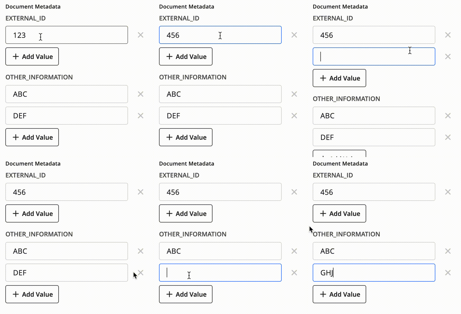
restricted_values is another option that can be toggled in the JSON configuration. If restricted_values is set to true, then the user will not be able to add strings to or remove strings from metadata keys’ values. They will only be able to edit a single value string.
⚠️ If there are no existing value strings for a key, and
restricted_valuesis set totrue, then the user will still be able to add a single value string for the metadata key.
Generic Input Configuration
There is some additional configuration that can be applied to any of the fields defined above. These are features supported by our more encompassing form builder know as JSON Schema Form. Here are a couple useful features that can be used for Custom Supervision:
UI settings - Allows you to hide components and disable input.
Dependencies settings - Sets conditions under which the values of the UI settings parameters can be automatically changed.
UI Settings
UI settings allow you to hide components and disable components. It also provides the ability to mark certain components as in need of review. To define a UI setting for a component, you need to add a subset of the following options:
hidden- boolean - Prevents the component from being shown in the action pane; defaults tofalse.disabled- boolean - Disables input for a component; defaults tofalse.needs_review- boolean - Forces the user to interact with this component before they can complete the task; defaults tofalse. As of v34, this feature is only supported for type: ‘transcription’.
Example
{
  action: [
    {
      name: 'document_tab',
      display: 'Document Data',
      input: [
        ...
        {
          name: 'example_disabled_component',
          type: 'transcription',
          data_identifier: 'be2fe4f4-a073-484c-a4b7-3579c3c6fc3b',
          title: 'Example Disabled Component',
          ui: {
            disabled: true
          }
        },
        {
          name: 'example_hidden_component',
          type: 'transcription',
          data_identifier: 'b18cb177-106a-44db-b395-03905ddf722a',
          title: 'Example Hidden Component',
          ui: {
            hidden: true
          }
        },
        {
          name: 'example_both_component',
          type: 'transcription',
          data_identifier: '9b6a1694-193f-4c87-a685-243572ab7779',
          title: 'Example Both Component',
          ui: {
            hidden: true,
            disabled: true
          }
        },
        ...
      ]
    }
  ]
}
Dependencies Settings
This is the most dynamic piece of Custom Supervision that takes some time to understand what makes sense to set up. The idea of dependencies in their initial iteration is to set conditions, which, when met, will be able to change the ui settings as defined above.
The most common predicted use case of this feature is to dynamically show and hide components by toggling the ui.hidden flag when a certain document or case is selected. Since submissions can contain several different layout variations, you may want to hide components that are irrelevant to the user. With dependencies, you can control which components show up when. Similarly, you can use the same approach to disable input for specific components.
Because depenedencies settings directly interact with the ui settings, you can also dynamically ui.disable fields, as well.
We are using the Ajv Library and are currently focused on using the const property in Ajv’s JSON schema validator to test equivalence. To learn more, see Ajv’s JSON Schema and const documentation.
This feature requires a larger JSON configuration to really show the benefit. The example below contains parts of some of the Input Components defined above, since it is a full working use case of how these components can be configured. It also uses mock UUIDs, just to be a little more clear what matches to what.
Dependencies Settings Example
{
  "action": [
    {
      "name": "review_data",
      "display": "Review Data",
      "input": [
        {
          "name": "tab_1_document_title",
          "type": "document_title",
          "title": "Document Title"
        },
        {
          "name": "participant_account_number",
          "data_identifier": "<participant_account_number_uuid>",
          "type": "transcription",
          "ui": {
            "hidden": true
          },
          "dependencies": [
            {
              "condition": {
                "properties": {
                  "layoutId": {
                    "const": "<beneficiary_change_layout_uuid>"
                  }
                }
              },
              "override": {
                "ui": {
                  "hidden": false
                }
              }
            }
          ]
        },
        {
          "name": "participant_name",
          "data_identifier": "<participant_name_uuid>",
          "type": "transcription",
          "ui": {
            "hidden": true
          },
          "dependencies": [
            {
              "condition": {
                "properties": {
                  "layoutId": {
                    "const": "<beneficiary_change_layout_uuid>"
                  }
                }
              },
              "override": {
                "ui": {
                  "hidden": false
                }
              }
            }
          ]
        },
        {
          "name": "current_beneficiary_name",
          "data_identifier": "<current_beneficiary_name_uuid>",
          "type": "transcription",
          "ui": {
            "hidden": true
          },
          "dependencies": [
            {
              "condition": {
                "properties": {
                  "layoutId": {
                    "const": "<beneficiary_change_layout_uuid>"
                  }
                }
              },
              "override": {
                "ui": {
                  "hidden": false
                }
              }
            }
          ]
        },
        {
          "name": "check_number",
          "data_identifier": "<check_number_uuid>",
          "type": "transcription",
          "ui": {
            "hidden": true
          },
          "dependencies": [
            {
              "condition": {
                "properties": {
                  "layoutId": {
                    "const": "<check_layout_uuid>"
                  }
                }
              },
              "override": {
                "ui": {
                  "hidden": false
                }
              }
            }
          ]
        },
        {
          "name": "payer_name",
          "data_identifier": "<payer_name_uuid>",
          "type": "transcription",
          "ui": {
            "hidden": true
          },
          "dependencies": [
            {
              "condition": {
                "properties": {
                  "layoutId": {
                    "const": "<check_layout_uuid>"
                  }
                }
              },
              "override": {
                "ui": {
                  "hidden": false
                }
              }
            }
          ]
        },
        {
          "name": "payer_address",
          "data_identifier": "<payer_address_uuid>",
          "type": "transcription",
          "ui": {
            "hidden": true
          },
          "dependencies": [
            {
              "condition": {
                "properties": {
                  "layoutId": {
                    "const": "<check_layout_uuid>"
                  }
                }
              },
              "override": {
                "ui": {
                  "hidden": false
                }
              }
            }
          ]
        }
      ]
    }
  ]
}
First, here is a GIF of what this code produces. Below, there is a more in-depth description and breakdown of the JSON to help clarify.
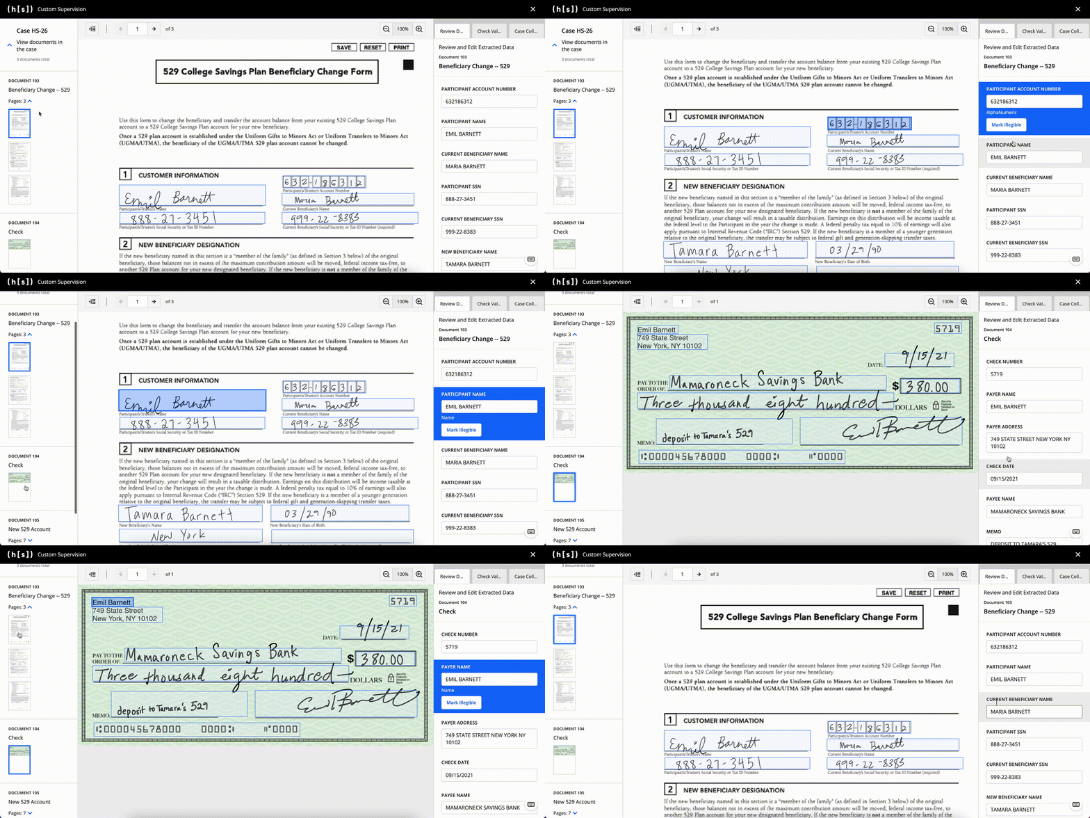
Note: The sample JSON above is trimmed to just a few components for each document compared to the components seen in the GIF. Also, the documents and transcribed fields use mock data with mock images.
Notice the
document_titlecomponent stays the same across both documents. This is because there are nodependenciesand it will always default toui.hidden: false.Looking at the first input defined, we have the
ui.hiddenproperty set totrue. If you want to achieve the dynamic rendering shown in the example, this setting is required.
        {
          "name": "participant_account_number",
          "data_identifier": "<participant_account_number_uuid>",
          "type": "transcription",
          "ui": {
            "hidden": true
          },
          "dependencies": [
            {
              "condition": {
                "properties": {
                  "layoutId": {
                    "const": "<beneficiary_change_layout_uuid>"
                  }
                }
              },
              "override": {
                "ui": {
                  "hidden": false
                }
              }
            }
          ]
        }
Each
dependenciescontains an array of conditions. Thus, you can configure multiple conditions under which a specific component is to be displayed, hidden, or disabled.Each dependency has a condition that needs to be met, and then an override that will take place. Again, the only overrides that make sense at this point are the ones that affect the
uisettings.In this specific example for
participant_account_number, the nesting ofcondition.propertiesis standard syntax when using Ajv.We have configurability around the next nesting, though:
layoutId- Used when you want to match to the currently selected layout.pageId- Used when you want to match to the currently selected page.documentId- Used when you want to match to the currently selected document.caseId- Used when you want to match to the currently selected case.
In this example, we use the
layoutIdto match against.The
constis the Ajv syntax for checking equivalence, as mentioned above.Putting all these elementes together, this condition is saying, “When the currently selected Layout ID is
<beneficiary_change_layout_uuid>, … “When this condition is true, the
overridewill toggle theui.hiddenflag tofalse.“When the currently selected Layout ID is
<beneficiary_change_layout_uuid>, show this field.”
Looking back at the GIF, you can see that the Participant Account Number component only appears when the Beneficiary Change document is selected.
You can review the rest of the sample JSON, but these points are the core of what is going on behind the scenes. There are some assumptions here that the data coming in for these documents, separate from what is defined in this input, have the layout UUIDs that match up (<beneficiary_change_layout_uuid> and <check_layout_uuid>).
UI Groups
UI groups determine how components should be grouped within a tab.
Adding a UI group is optional. If you do not add a UI group, all Input Components will be included in a single section in the order they are defined.
If you do include a UI group, the string defined within each fields list needs to correspond to a component name in the input section.
⚠️ You’ll notice that throughout this documentation, we refer to the UI components that can be added to the
fieldslist as “Input Components” rather than as “Fields” or “Input Fields.” We’ve made this distinction to avoid confusion with the concept of a “layout field” that can be a part of document and is a specific sub-type of the transcription input component.
To add a UI group, you need to define the following properties:
fields- List that contains thenameproperties of the Input Components you want to add to the UI group.(optional)
title- Text displayed at the top of a UI group. If you do not define atitleproperty for a group, the listed components will still be grouped together, but no text will be displayed at the top of the UI group.
Multiple groups are separated by a single horizontal line. The order in which Input Components are displayed on a tab matches the order of the Input Components in the fields list.
No Titles
{
  ui: {
    groups: [
      {
        fields: ['ssn_field']
      },
      {
        fields: [
          'check_amount_field',
          'account_number'
        ],
      },
    ]
  }
}
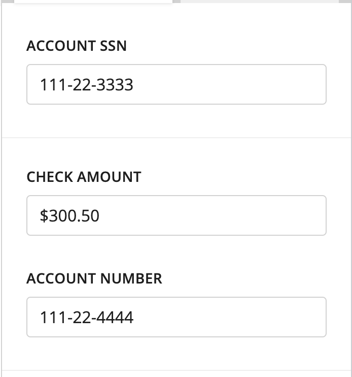
Light horizontal divider between the two groups
With Titles
{
  ui: {
    groups: [
      {
        title: 'My Group',
        fields: ['ssn_field']
      },
      {
        title: 'Check Info',
        fields: ['check_amount_field', 'account_number']
      }
    ]
  }
}
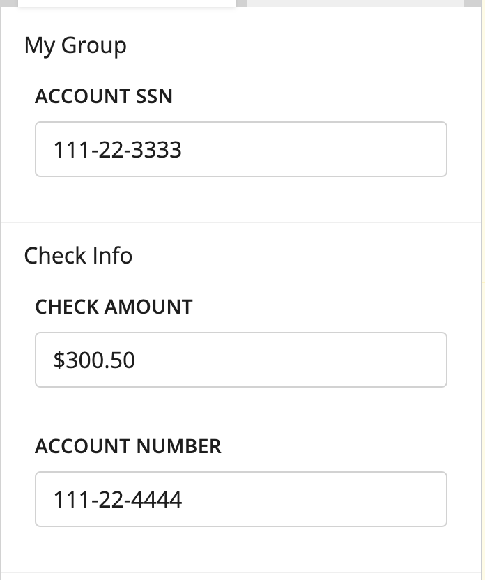
Missing Fields
{
  ui: {
    groups: [
      {
        title: 'My Group',
        fields: ['ssn_field']
      },
      {
        title: 'Check Info',
        fields: ['check_amount_field']
      }
    ]
  }
}
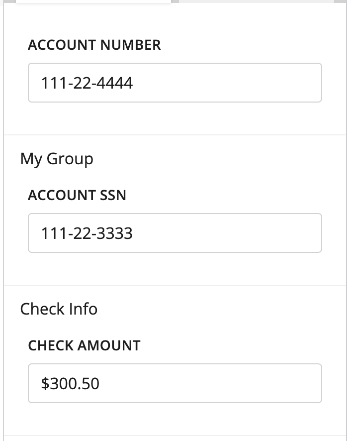
Input Components that are not added to any UI group appear at the top of the tab. Here, Account Number is not defined within groups, so it is shown at the top.
External Sources
In addition to customizing the three-panel interface, you can also display pages that come from submissions that the Custom Supervision Block is not currently processing (“external submissions”). Users can compare these pages with the documents and pages being processing through the Custom Supervision Block.
To display pages from external submissions, you need to define their respective page IDs at the same level as supervision_template. Here is an example of defining page IDs:
{
  page_ids: [1, 2, 3, 15],
  supervision_template: [
    {
      name: 'three_column_template',
      version: '1.0'
    }
  ]
}
⚠️ There are restrictions that come with this added flexibility. Since this data is not in the current submission and thus may have already gone through transcription and other Supervision tasks, all transcription components that are displayed for these pages will be uneditable.
Examples
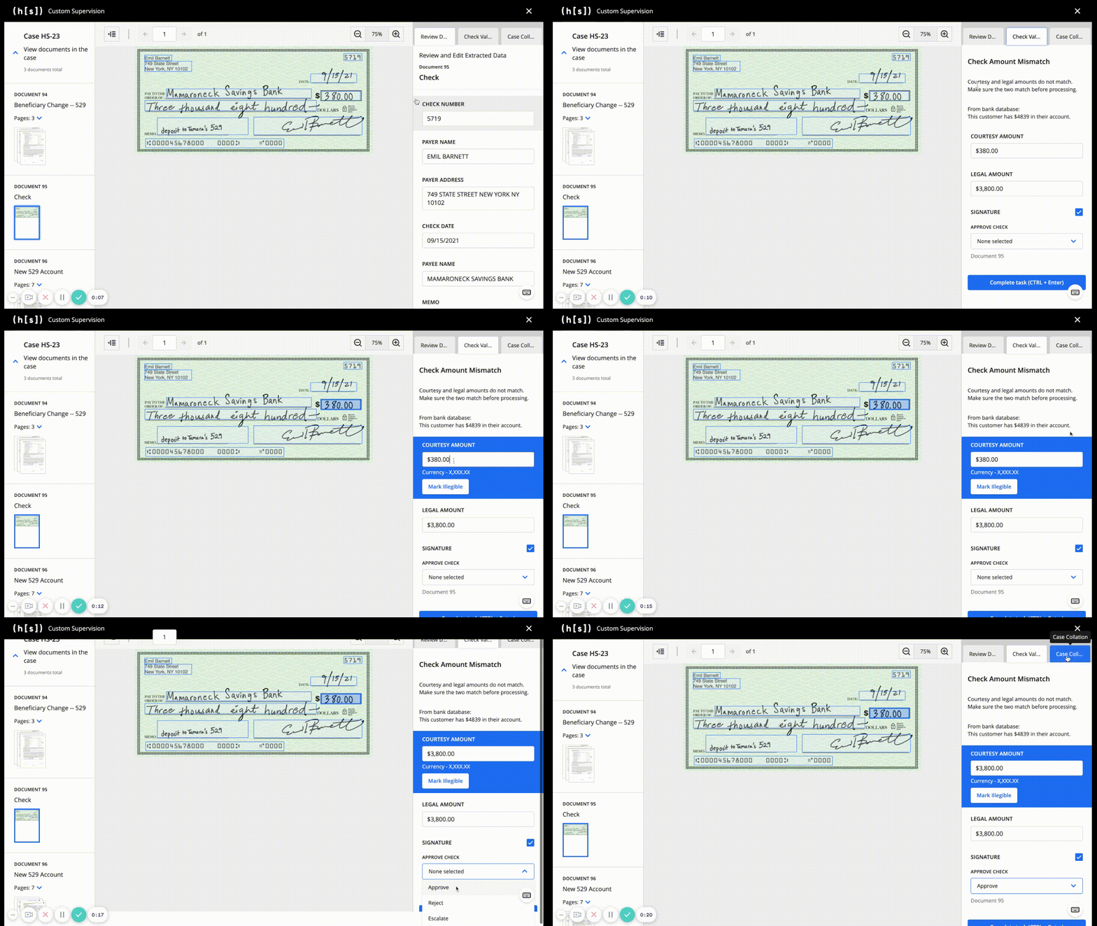
Here is a full example of a two-tab setup. Again, we used mock UUIDs for readability.
{
supervision_template: [
{
name: 'three_column_template',
version: '1.0',
thumbnail: {
group_by_document: true,
group_by_case: true,
},
action: [
{
name: 'document_tab',
display: 'Document Data',
input: [
{
name: 'doc_title',
type: 'document_title',
},
{
name: 'check_amount',
type: 'transcription',
data_identifier: '<check_amount_uuid>',
title: 'Check Amount',
ui: {
hidden: true,
},
dependencies: [
{
condition: {
properties: { layoutId: { const: '<check_layout_uuid>' } },
},
override: { ui: { hidden: false } },
},
],
},
{
name: 'check_pay_to_the_order_of',
type: 'transcription',
data_identifier: '<check_pay_to_the_order_of_uuid>',
title: 'Pay to the Order of',
ui: {
hidden: true,
},
dependencies: [
{
condition: {
properties: { layoutId: { const: '<check_layout_uuid>' } },
},
override: { ui: { hidden: false } },
},
],
},
{
name: 'check_date',
type: 'transcription',
data_identifier: '<check_date_uuid>',
title: 'Name',
ui: {
hidden: true,
},
dependencies: [
{
condition: {
properties: { layoutId: { const: '<check_layout_uuid>' } },
},
override: { ui: { hidden: false } },
},
],
},
{
name: 'check_decision',
type: 'decision',
data_identifier: '<check_name_uuid>',
title: 'Decision',
relation: {
type: 'document',
},
schema: {
oneOf: [
{
const: 'accept',
title: 'Accept Check',
},
{
const: 'reject',
title: 'Reject Check',
},
{
const: 'return',
title: 'Return overpaid fees',
},
],
},
ui: {
hidden: true,
},
dependencies: [
{
condition: {
properties: { layoutId: { const: '<check_layout_uuid>' } },
},
override: { ui: { hidden: false } },
},
],
},
{
name: 'change_of_bene_name',
type: 'transcription',
data_identifier: '<change_of_bene_name_uuid>',
title: 'Name',
ui: {
hidden: true,
},
dependencies: [
{
condition: {
properties: {
layoutId: { const: '<account_application_layout_uuid>' },
},
},
override: { ui: { hidden: false } },
},
],
},
{
name: 'change_of_bene_dob',
type: 'transcription',
data_identifier: '<change_of_bene_dob_uuid>',
title: 'Date of Birth',
ui: {
hidden: true,
},
dependencies: [
{
condition: {
properties: {
layoutId: { const: '<account_application_layout_uuid>' },
},
},
override: { ui: { hidden: false } },
},
],
},
{
name: 'change_of_bene_ssn',
type: 'transcription',
data_identifier: '<change_of_bene_ssn_uuid>',
title: 'SSN',
ui: {
hidden: true,
},
dependencies: [
{
condition: {
properties: {
layoutId: { const: '<account_application_layout_uuid>' },
},
},
override: { ui: { hidden: false } },
},
],
},
{
name: 'change_of_bene_phone_number',
type: 'transcription',
data_identifier: '<change_of_bene_phone_number_uuid>',
title: 'Phone Number',
ui: {
hidden: true,
},
dependencies: [
{
condition: {
properties: {
layoutId: { const: '<account_application_layout_uuid>' },
},
},
override: { ui: { hidden: false } },
},
],
},
{
name: 'change_of_bene_trustees_ssn',
type: 'transcription',
data_identifier: '<change_of_bene_trustees_ssn_uuid>',
title: "Participant's/Trustee's SSN",
ui: {
hidden: true,
},
dependencies: [
{
condition: {
properties: {
layoutId: { const: '<change_of_bene_layout_uuid>' },
},
},
override: { ui: { hidden: false } },
},
],
},
{
name: 'change_of_bene_new_bene_ssn',
type: 'transcription',
data_identifier: '<change_of_bene_new_bene_ssn_uuid>',
title: "New Beneficiary's SSN",
ui: {
hidden: true,
},
dependencies: [
{
condition: {
properties: {
layoutId: { const: '<change_of_bene_layout_uuid>' },
},
},
override: { ui: { hidden: false } },
},
],
},
{
name: 'change_of_bene_descendant',
type: 'transcription',
data_identifier: '<change_of_bene_descendant_uuid>',
title: 'Son/Daughter/Descendant',
ui: {
hidden: true,
},
dependencies: [
{
condition: {
properties: {
layoutId: { const: '<change_of_bene_layout_uuid>' },
},
},
override: { ui: { hidden: false } },
},
],
},
{
name: 'change_of_bene_partial_account_xfer',
type: 'transcription',
data_identifier: '<change_of_bene_partial_account_xfer_uuid>',
title: 'Partial Account Transfer',
ui: {
hidden: true,
},
dependencies: [
{
condition: {
properties: {
layoutId: { const: '<change_of_bene_layout_uuid>' },
},
},
override: { ui: { hidden: false } },
},
],
},
{
name: 'change_of_bene_partial_account_xfer_amount',
type: 'transcription',
data_identifier: '<change_of_bene_partial_account_xfer_amount_uuid>',
title: 'Partial Account Transfer Amount',
ui: {
hidden: true,
},
dependencies: [
{
condition: {
properties: {
layoutId: { const: '<change_of_bene_layout_uuid>' },
},
},
override: { ui: { hidden: false } },
},
],
},
],
ui: {
groups: [
{
fields: ['doc_title'],
},
{
fields: [
'check_amount',
'check_pay_to_the_order_of',
'check_date',
'check_decision',
'change_of_bene_name',
'change_of_bene_dob',
'change_of_bene_ssn',
'change_of_bene_phone_number',
'change_of_bene_trustees_ssn',
'change_of_bene_new_bene_ssn',
'change_of_bene_descendant',
'change_of_bene_partial_account_xfer',
'change_of_bene_partial_account_xfer_amount',
],
},
],
},
},
{
name: 'case_tab',
display: 'Case Data',
input: [
{
name: 'case_title',
type: 'case_title',
},
{
name: 'instructions',
type: 'text_block',
title: '',
description:
'Instructions:\n$100 Processing fee\n$50 optional fee for expediting case',
ui: {
hidden: true,
},
dependencies: [
{
condition: { properties: { caseId: { const: '99021' } } },
override: { ui: { hidden: false } },
},
{
condition: { properties: { caseId: { const: '100034' } } },
override: { ui: { hidden: false } },
},
],
},
{
name: 'region',
type: 'decision',
title: 'Region',
relation: {
type: 'case',
},
schema: {
oneOf: [
{
const: 'new_york',
title: 'New York',
},
{
const: 'boston',
title: 'Boston',
},
{
const: 'philadelphia',
title: 'Philadelphia',
},
],
},
ui: {
hidden: true,
},
dependencies: [
{
condition: { properties: { caseId: { const: '99021' } } },
override: { ui: { hidden: false } },
},
{
condition: { properties: { caseId: { const: '100034' } } },
override: { ui: { hidden: false } },
},
],
},
{
name: 'flag',
type: 'decision',
title: 'Flag',
relation: {
type: 'case',
},
schema: {
oneOf: [
{
const: 'yes',
title: 'Yes, flag case',
},
{
const: 'no',
title: 'No, case clear',
},
],
},
ui: {
hidden: true,
},
dependencies: [
{
condition: { properties: { caseId: { const: '99021' } } },
override: { ui: { hidden: false } },
},
{
condition: { properties: { caseId: { const: '100034' } } },
override: { ui: { hidden: false } },
},
],
},
],
ui: {
groups: [
{
fields: ['case_title'],
},
{
fields: ['instructions', 'region', 'flag'],
},
]
}
}
]
}
]
}
Images and data are all mocked (and often repeated), but hopefully, you now have an idea of what can be done with Custom Supervision.
Data Payload
⚠️ Note that this payload is only relevant when using the Custom Supervision Block directly as opposed to the IDP Custom Supervision Block. The IDP Custom Supervision automatically populates the
datafield for you.
When using the Custom Supervision Block directly, one should be more deliberate how to populate the data payload. It is the primary source of truth for Custom Supervision, and the UI depends on it to render properly. It’s not recommended to populate data manually, but there are some instances where a user may want to populate data that does not exist in the database. For example, you would manually populate data after a Full Page Transcription flow if you wanted to use Custom Supervision to display crops. If a user chooses to manually populate data, there are some guidelines to follow to ensure a seamless experience.
⚠️ In v38 and later, an invalid
datapayload will cause the flow to fail.
Formatting
Here is the schema validated by the Custom Supervision Block. Note that you can add fields that are outside of this definition; the block validates only those mentioned below.
For data, we follow the defined dataclass. Note that these fields, with the exception of task_purpose_code, are all optional lists.
class Data:
  task_purpose_code: Optional[int]
  pages: Optional[list[Page]]
  cases: Optional[list[Case]]
  documents: Optional[list[Document]]
  fields: Optional[list[FieldData]]
  template_fields: Optional[list[TemplateField]]
  tables: Optional[list[Table]]
  selected_choices: Optional[list[SelectedChoice]]
  crops: Optional[list[Crop]]
cases
class Case:
  id: int
  uuid: UUID
  external_case_id: str
  start_time: str
  update_time: str
  to_delete_time: Optional[str]
  notes: str
  documents: list[int]
  unassigned_pages: list[int]
  submission_files: list[str]
  submissions: list[int]
pages
class Page:
    id: int
    file_page_number: int
    document_page_number: Optional[int]
    image_url: Optional[str]
    form_id: Optional[int]
    submission_id: int
    external_case_ids: list[str]
    read_only: bool
    filename: str
    form_page_id: Optional[int]
documents
class Document:
  id: int
  layout_uuid: UUID
  layout_name: str
  pages_count: int
  read_only: bool
fields
class Field:
  id: int
  uuid: UUID
  value: Optional[Union[bool, str]]
  page_id: int
  layout_field_id: UUID
  bounding_box: Optional[list[float]]
  validation_overridden: bool
  occurrence_index: Optional[int]
template_fields
class TemplateField:
  uuid: UUID
  notes: str
  type: str
  data_type_uuid: UUID
  name: str
tables
class Table:
  id: int
  name: str
  uuid: UUID
  document_id: int
  layout_table_uuid: UUID
  parent_table_uuid: Optional[UUID]
  parent_layout_table_uuid: Optional[UUID]
  rows: list[Row]
  columns: list[Column]
  cells: list[Cell]

class Cell:
  id: int
  uuid: UUID
  row_uuid: UUID
  column_uuid: UUID
  value: Optional[Union[bool, str]]
  bounding_box: Optional[list[float]]
  validation_overridden: bool
  page_id: int

class Column:
  uuid: UUID
  name: str
  data_type_uuid: UUID

class Row:
  id: int
  uuid: UUID
selected_choices
class SelectedChoice:
  decision_name: str
  choice_name: str
  task_purpose_id: int

  case_id: Optional[int]
  document_id: Optional[int]
  field_id: Optional[int]
  page_id: Optional[int]
  cell_uuid: Optional[UUID]
crops
class Crop:
  uuid: UUID
  page_id: int
  bounding_box: Optional[list[float]]
  value: str
chats
class ChatData:
    type: str
    identifier: str
    input: dict[str, Any]
ID References
You may have noticed that the schemas of individual fields all have some sort of identifier, usually id but sometimes uuid. We validate that any of the included id/uuids in one key of data should exist elsewhere. As an example, for every page_id in Field, there should be a corresponding id in Page.
✅ Valid Reference
"pages": [
    {
    "id": 1,
    "file_page_number": 1,
    "document_page_number": 1,
    "image_url": "/image/2ed3d989-b64a-44bd-a9fb-6e0dcc5ccdb8",
    "form_id": 1,
    "submission_id": 1,
    "external_case_ids": [],
    "read_only": false,
    "filename": "1 page.pdf",
    "form_page_id": 1
    }
],
"fields": [
  {
    "id": 1,
    "uuid": "1ebb7125-1664-4268-9a1a-8a7c5a75ffd4",
    "value": "Test",
    "page_id": 1,  # This matches the defined page with ID of 1
    "layout_field_id": "71046ffb-8f00-4da5-aef9-9bf74a7bddc8",
    "bounding_box": [
      0.616888888888889,
      0.262362637362637,
      0.883555555555556,
      0.276098901098901
    ],
    "validation_overridden": false,
    "occurrence_index": 0
  }
]
❌ Invalid Reference
"pages": [
    {
    "id": 1,
    "file_page_number": 1,
    "document_page_number": 1,
    "image_url": "/image/2ed3d989-b64a-44bd-a9fb-6e0dcc5ccdb8",
    "form_id": 1,
    "submission_id": 1,
    "external_case_ids": [],
    "read_only": false,
    "filename": "1 page.pdf",
    "form_page_id": 1
    }
],
"fields": [
  {
    "id": 1,
    "uuid": "1ebb7125-1664-4268-9a1a-8a7c5a75ffd4",
    "value": "Test",
    "page_id": 15,  # There is no page with ID of 15 defined
    "layout_field_id": "71046ffb-8f00-4da5-aef9-9bf74a7bddc8",
    "bounding_box": [
      0.616888888888889,
      0.262362637362637,
      0.883555555555556,
      0.276098901098901
    ],
    "validation_overridden": false,
    "occurrence_index": 0
  }
]
List of Reference Validations
For every
page_idinfields, there should be a correspondingidinpages.For every
layout_field_idinfields, there should be a correspondinguuidintemplate_fields.For every
form_idinpages, there should be a correspondingidindocuments.For every
document_idintables, there should be a correspondingidindocuments.For every
case_idinselected_choices, there should be a correspondingidincases.For every
document_idinselected_choices, there should be a correspondingidindocuments.For every
field_idinselected_choices, there should be a correspondingidinfields.For every
page_idinselected_choices, there should be a correspondingidinpages.For every
cell_uuidinselected_choices, there should be a correspondinguuidintable.cells.For every
field_idinselected_choices, there should be a correspondingidinfields.For every
page_idintable.cells, there should be a correspondingidinpages.For every
row_uuidintable.cells, there should be a correspondinguuidintable.rows.For every
column_uuidintable.cells, there should be a correspondinguuidintable.columns.For every
page_idincrops, there should be a correspondingidinpages.
Example of Valid data
"data": {
  "task_purpose_code": 2003,
  "pages": [
    {
      "id": 1,
      "file_page_number": 1,
      "document_page_number": 1,
      "image_url": "/image/2ed3d989-b64a-44bd-a9fb-6e0dcc5ccdb8",
      "form_id": 1,
      "submission_id": 1,
      "external_case_ids": [],
      "read_only": false,
      "filename": "1 page.pdf",
      "form_page_id": 1
    }
  ],
  "cases": [
    {
      "id": 1,
      "uuid": "1ebb7125-1664-4268-9a1a-8a7c5a75ffd1",
      "external_case_id": "HS-1",
      "start_time": "2023-07-10T21:29:50.379413Z",
      "update_time": "2023-07-10T21:32:57.824724Z",
      "to_delete_time": null,
      "notes": "",
      "documents": [
          1
      ],
      "unassigned_pages": [],
      "submission_files": [
          "1939_f_1.jpg"
      ],
      "submissions": [
          1
      ]
    }
  ],
  "documents": [
    {
      "id": 1,
      "layout_uuid": "8bc9739d-2fc3-4ffa-b8b8-14e12155b64c",
      "layout_name": "MCCANN_ZENITH",
      "pages_count": 1,
      "read_only": false
    }
  ],
  "fields": [
    {
      "id": 1,
      "uuid": "1ebb7125-1664-4268-9a1a-8a7c5a75ffd4",
      "value": "Test",
      "page_id": 1,
      "layout_field_id": "71046ffb-8f00-4da5-aef9-9bf74a7bddc8",
      "bounding_box": [
          0.616888888888889,
          0.262362637362637,
          0.883555555555556,
          0.276098901098901
      ],
      "validation_overridden": false,
      "occurrence_index": 0
    }
  ],
  "template_fields": [
    {
      "uuid": "71046ffb-8f00-4da5-aef9-9bf74a7bddc8",
      "notes": "",
      "type": "entry",
      "data_type_uuid": "5b4101e7-58eb-4fba-8247-c1486cc8b45c",
      "name": "Claimant ID"
    }
  ],
  "tables": [
    {
      "id": 1,
      "name": "Table 1",
      "uuid": "3d960b0c-724a-4ee2-adef-da29e038c331",
      "document_id": 1,
      "layout_table_uuid": "30270622-becd-4e80-ad06-ca2197e92358",
      "parent_table_uuid": null,
      "parent_layout_table_uuid": null,
      "rows": [
          {
            "id": 1,
            "uuid": "dce0158b-0d97-40ea-b794-de029339df2e"
          }
      ],
      "columns": [
          {
            "uuid": "f23e9370-4f1f-4a8d-beee-e3f27aed252b",
            "name": "NETWORK CODE",
            "data_type_uuid": "5b4101e7-58eb-4fba-8247-c1486cc8b441"
          }
      ],
      "cells": [
          {
            "id": 1,
            "uuid": "b0a10394-8b56-458e-ae5a-cfa5824bbdb4",
            "row_uuid": "dce0158b-0d97-40ea-b794-de029339df2e",
            "column_uuid": "f23e9370-4f1f-4a8d-beee-e3f27aed252b",
            "value": "0130P0200P",
            "bounding_box": [
              0.6875,
              0.3134765625,
              0.7548828125,
              0.32421875
            ],
            "validation_overridden": false,
            "page_id": 1
          }
      ]
    }
  ],
  "selected_choices": [
    {
      "decision_name": "verify_account",
      "choice_name": "yes",
      "task_purpose_id": 2003,
      "case_id": null,
      "document_id": null,
      "field_id": null,
      "page_id": 1,
      "cell_uuid": null
    }
  ],
  "crops": [
    {
      "uuid": "8e84768a-30f2-4867-9bfa-30370b98f148",
      "page_id": 1,
      "bounding_box": [
        0.6875,
        0.3134765625,
        0.7548828125,
        0.32421875
      ],
      "value": "Test"
    }
  ],
  "chats": [
    {
      "type": "flow",
      "identifier": "CHAT_COMPLETION_FLOW",
      "input": {
        "blob_uuid": "8e84768a-30f2-4867-9bfa-30370b98f148"
      }
    }
  ]
}